Have you ever wondered what the difference is between RGB and CMYK? Do you recognise the names but never understood what they mean? And do you know what Pantone colours are?
Hopefully this short blog will help you understand the different colour profiles and why they are so important when it comes to design and your brand.
RGB
RGB (Red Green Blue) is the colour mode used for screen displays – like computers, mobile phones and televisions. Unlike mixing inks or paints, RBG is an additive colour model, where hues are created with different combinations of red, green and blue light.
If you are creating images for use online, such as your website, social media or digital advertising, you should always use RGB colour mode. This will ensure that your images are displayed at their best, and the colours will appear as vibrant and accurate as possible.
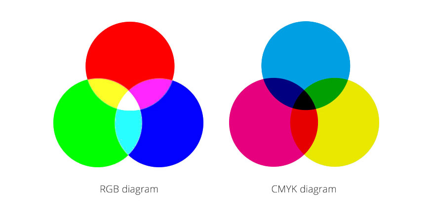
CMYK
CMYK (Cyan Magenta Yellow Key) is used in print and is a subtractive colour mode.
Printers apply pigments onto paper in tiny cyan, magenta, yellow and black dots. These dots can be spread out or close together to create the desired colours.
When designing for print you should always use CMYK colour mode to ensure the colours print as accurately as possible.
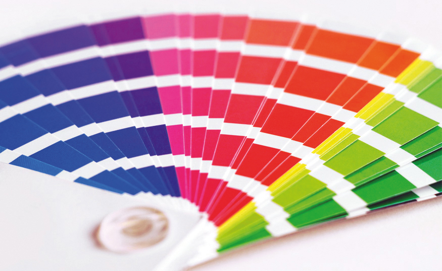
Pantone
Pantone is a standardised colour matching system. Different print manufacturers around the world can refer to ‘The Pantone Colour Matching System’ to ensure colours match across all printed items. Pantone colours are used when it is critical a colour is reproduced correctly.